
Customize the widget's theme
You can customize how the MoonPay widget looks to match the branding of your website and provide a more native user experience. We call those customizations a theme.
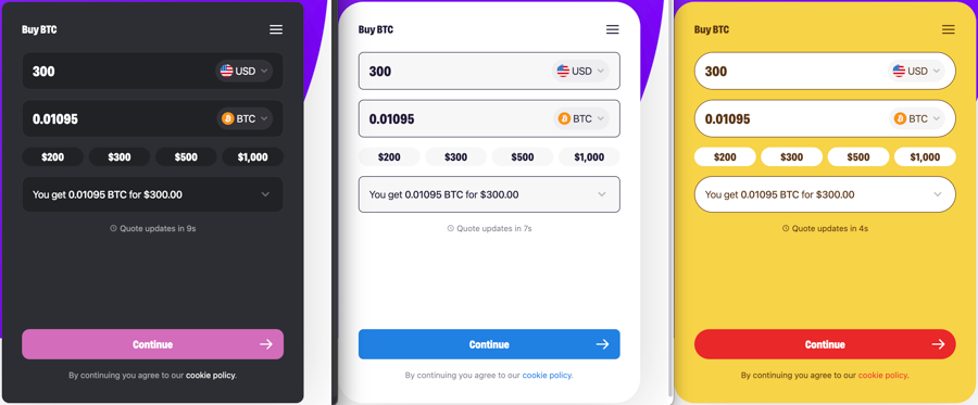
Theme elements that can currently be customized include:
Logo in header
Colors, including support for light and dark mode
Corner radius buttons
Corner radius of foreground elements
Icons
Platters
Input fields
Theme elements that will be customizable soon include:
Size configurations
Default
Compact
Pinned left or right full height
Themes are created specifically for your website or application and will have an associated themeId that you include when initializing the Web SDK.
We are currently developing a self-serviced "build your own theme" feature. In the meantime, we'll create the theme for you, you just have to contact your Partner Success Manager.
Once you have a themeId, you can include it in the parameters property of your SDK configuration. When the SDK is initialized with a valid themeId, the widget will load with the custom theme created for your application.
Updated 3 months ago
Table of Contents
What can be customized?
How can I create my theme?
How can I use a theme?